
[vc_row type=”in_container” full_screen_row_position=”middle” scene_position=”center” text_color=”dark” text_align=”left” overlay_strength=”0.3″ shape_divider_position=”bottom”][vc_column column_padding=”no-extra-padding” column_padding_position=”all” background_color_opacity=”1″ background_hover_color_opacity=”1″ column_shadow=”none” column_border_radius=”none” width=”1/1″ tablet_text_alignment=”default” phone_text_alignment=”default” column_border_width=”none” column_border_style=”solid”][vc_column_text]What’s often forgotten about design is that it’s not just about a pretty picture or functional object – design is all about the user. Whether you are looking at a digital product or physical one, it’s consistently designed with the user in mind – and not just aesthetically, but intuitively and empathetically.
After a decade of rapidly evolving technologies, we are seeing businesses return to this idea of a deep commitment to the customer – whether it’s through new contactless payment methods, the rise of pre-order and pickup, or the surge in on-demand delivery options, companies are once again putting customers at the core of every business decision.
At TheAppLabb, this type of work is the core of what we do as experienced mobile app developers in Toronto – it’s the beginning of our thought process and the end of our usability testing. From A to Z, we focus on what the end users of our products will see, hear, feel, and touch – and the most successful products combine this mindset with laser-targeted end-goals to create what we in the business call the user’s “happy path” (more on that later).
In this blog, we’ll be showing you why design matters for business key performance indicators (KPIs), what different aspects of design are considered during mobile app projects, and how you can incorporate this mindset into your own processes and products.
The goal of good design: simplicity
Good business leaders fundamentally understand most key performance indicators like revenue, engagement and total lifetime value, but what about some of the unseen but highly impactful customer KPIs?
A huge component in building out exceptional customer experiences lies in the hands of designers and the work they do. Throughout every touchpoint, designers are looking to reduce friction, remove barriers and create intuitive, accessible and predictable experiences.
Given the rapidly changing nature of technology, design has rightly become a key partner for ensuring that customers can easily navigate the complexities that often accompany emerging technologies.
How design impacts your business success
One of the core benchmarks of design is to simplify complexity for the user while achieving business goals, and a strong UX/UI (we’ll get into this a bit later in the blog) has become the embodiment of this mission.
Do most of us intrinsically understand why design matters?
More importantly, why should anyone looking to build out exceptional digital products make design a core tenet of their project – and ultimately their project budget?
A 2016 design study of 408 different companies found that the more a company invested in and focused on design, the more sales they saw.
Those companies who had design as a central tenet of their business strategy (referred to as “design unicorns” in the study) found a measurable impact on core KPI’s like sales (+14%), customer retention (+44%), customer engagement (+21%), and faster product cycles overall (+30%). Whether a website, mobile app or B2B tool, nearly every business with a digital presence across industries can benefit from a successful design strategy.
Investing in good design is essential as part of your user centric business goals and objectives. In the next section, we share some of the key KPIs that should be included in your customer-centric dashboard when creating your app development strategy.
The McKinsey Design Index
The team at McKinsey have started to look at design as it relates to an integral part of an overall business strategy and have developed what they coin as the McKinsey Design Index(MDI).
This index rates companies by how strong they are at design and – more importantly – what this means for key traditional business KPIs like revenue and returns to their shareholders. The companies they looked at included medical technology, consumer goods, and retail banking industries.
The business benefits of user-centric design
The data from both the McKinsey research and the NEA report undeniably support the benefits of user-centric design. The biggest takeaways show an impact on annual growth, market share, customer satisfaction and overall cost reductions – here are just a few:
A strong focus on design equals higher revenue overall
Of the companies McKinsey categorized as being in the top percentile of the MDI, they found that they outperformed their competitors by showing an annual growth measured by revenue at 10% as compared to between 3-6% for those not indexing high on design as a central tenet of their business strategy.
An increase in overall usability scores (customer satisfaction) has a measurable impact on market share.
The McKinsey team also unlocked a study of a medical equipment group that tied usability metrics and customer satisfaction scores to executive bonuses as a means to meaningfully ward off competitor threats. The company focused heavily on developing over 100 concepts and prototypes that were deeply focused on usability and customer experience.
In the end, this strong focus on the end user and usability (customer satisfaction) meant that their final design’s usability score exceeded 90 percent (and market share increase of 40%), compared with less than 76 percent for the machines of its two main competitors. Through a company-wide focus on and prioritization of the end user, the company was able to unlock the key to impacting their strategic business goals.
A strong focus on design thinking and user-centric design at the beginning of a development project has huge implications for the overall costs of the final product
By investing in up-front user experience (UX) research, you are reducing your overall development and engineering costs by reducing the total number of iterations needed, and ultimately reducing your customer/client support costs once the project is completed.
A user-centred approach assures that you are building the right experience out of the gate, that end users have very little friction or challenges with your end product, and that they therefore require much less custom support once the product is in market.
A frictionless experience also means an overall increase in sales, customer retention and engagement overall
The team at NEA conducted a study of 400+ design centric start-ups and from this group looked at subsets of companies that they deemed Design Mature (raised at least $20mm in funding) or Design Unicorns (valuation of $1 billion). The criteria for these groups was having 20+ designers on their team and a shared belief that design had a material impact on their success. Overall they found that design had a measurable and positive impact on their success. Of the Design Unicorn subset they found even more proof of the impact of design thinking as a critical impact on results.
- Design leads to higher sales: +14% among design unicorns
- Design leads to higher customer retention: + 44% among design unicorns
- Design leads to higher customer engagement: +21% among design unicorns
- Design leads to faster product cycles: +30% among design unicorns
How we incorporate design best practices from the start
It is clear that design thinking and design-centred customer strategies are yielding positive business results, but how does this look in practice?
At TheAppLabb we view design as integral to the process from discovery right through to delivery and launch of the product in the market. This means that design and user-centred thinking informs all of our build and process decisions on behalf of our clients.
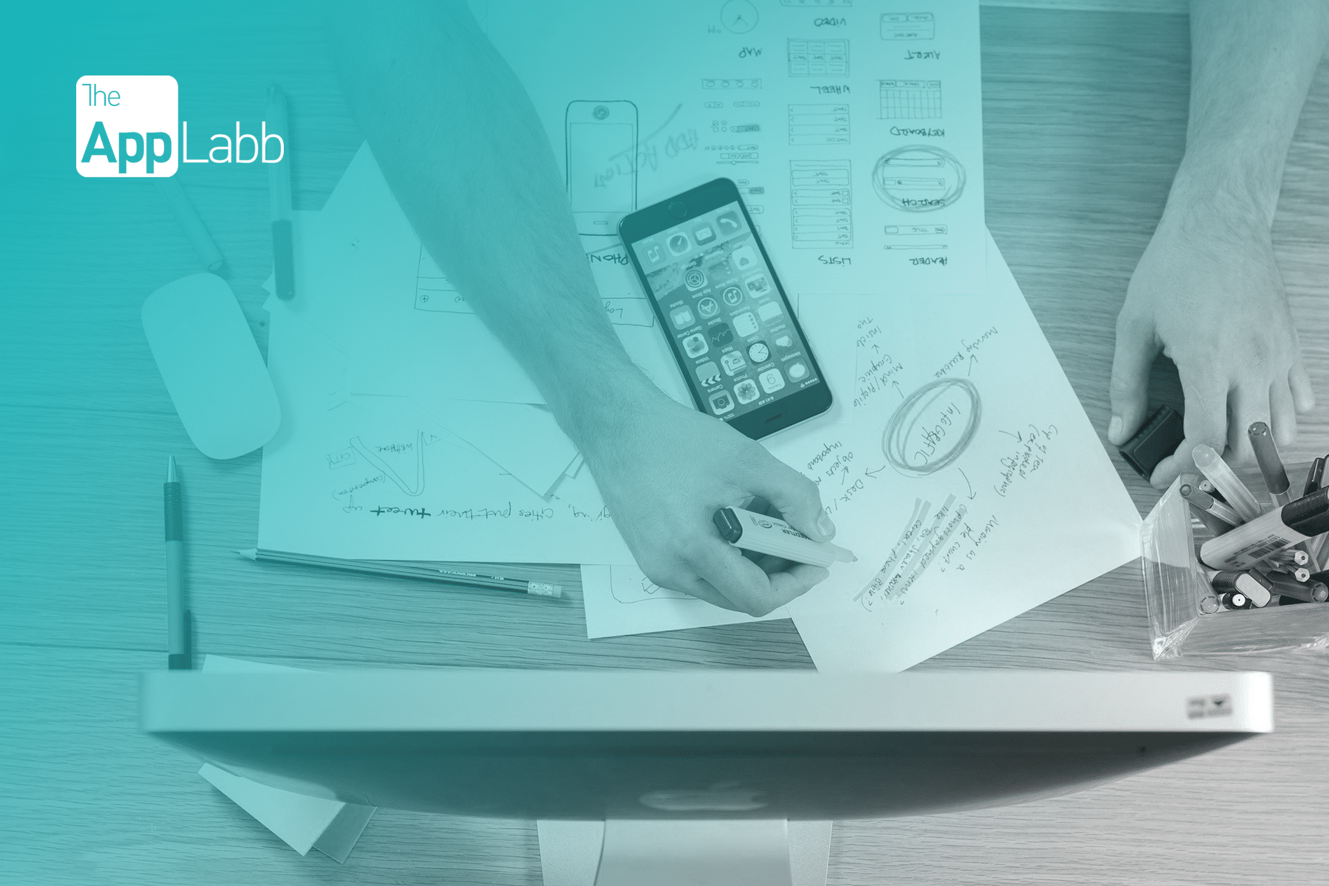
At the outset of the discovery phase with our clients, our design team performs field studies and builds personas for our clients’ target customers to help us find valuable insights based on specific customer needs and wants. Based on these insights, we then start to draw out some simple pen and paper sketches of what the product could look like as it directly relates to the customer experience.
![]()
These rapid prototypes help us in brainstorming and improvising on the desired design and its overall user experience at an early stage so that we can decrease the risk of errors closer to the launch. We refer to these initial sketches as a low fidelity prototype or wireframe of the application we are building.
Think of the process of designing a new kitchen, as an example. The first step would likely be a pencil sketch of the overall look and design you are seeking. You are trying to get an idea of what design elements you want to include, basic measurements to make sure that functionality is at the core of the project; can I have an island and still make it easy to get to the fridge or stove?
This would be the low fidelity wireframe part of the process. With effective user testing (e.g. is my kitchen still functional and easy to use based on observing everyday use and user interviews), we also identify usability problems with a design as early as possible, so they can be fixed before implementing or mass producing the design.
By incorporating deeply user-centred UX processes at the very start, we can then confidently move on to refining the prototypes and designing an aesthetically appealing user interface (UI) for the entire product. All these design strategies combined provide us with a greater confidence to be able to launch a desirable product in the market.
With the kitchen planning example, you would now have a digital map of your plan which includes concise measurements of cupboards, flooring and appliances as well as a detailed visualization of materials, swatches etc. This allows you to truly visualize the space and functionality and to confirm that it meets your specific needs and wants.
Core design concepts every leader should understand
User-centred design also includes thinking about some of the other core concepts of design that we keep in mind while designing a successful mobile app.
User experience versus user interface
UX and UI design are commonly paired together and are prioritised by tech companies to build winning products. However, the two terms are commonly interchanged, and understanding the difference between the two concepts is vital for any business.
![]()
User Experience (UX) is the overall experience a user goes through with a company’s product or services. Good and bad user experience design is determined by how easy or difficult it is to interact with each element of the app design. A successful UX design results in a simple and an extremely user-friendly experience, and aims to turn customers into loyal users.
At TheAppLabb, our UX designers base their design thinking on market research, understanding customer pain points, potential market gaps, and competitor analysis. We also look at user behaviors, their functional interactions, and emotional reactions throughout the user journey. This all becomes the foundation of our UX strategies. We then take into account the business goals and objectives of our clients, and align the experience with the company’s visions and missions.
For instance, at the UX stage we find solutions to common experiences like:
- Is the user flow smooth, seamless, and intuitive, or is it confusing?
- Does the button color and position encourage people to click and take action?
- Does a descriptive and easy onboarding process add clarity for the user?
- Does improving the UX copy or tone of the content increase conversion?
By asking and answering these questions, a good UX designer creates solutions and solves problems users are struggling with.
In comparison, User Interface (UI) is the visual representation of the app’s graphical user interface. A successful user interface decides how appealing and instinctive each element of the product will look, including buttons, placeholders, text, images, checkboxes, and any other intuitive interactions.
While our UX designers decide how the interface works, UI designers focus more on the aesthetics. They carefully study each client’s brand guidelines and align them with a style of color palettes, button styles, animation, graphics, typography, diagrams, widgets, etc. Our UI designers also optimize interfaces for different devices carefully considering the growing need for responsive design for both desktop and mobile users. Saving time and money for our clients with such expertise, we therefore create one version of the overall design that scales content and elements to match any screen size.
With a strong team of UX/UI designers combined, we carefully look at every aspect of design and why it matters for a great mobile app experience. We take into account the various concepts of human-centred design and always aim to design an app that is future-proofed for our clients. We want to build the perfect kitchen that is not only beautiful to look at and exactly what the client wants in terms of look and feel, but that is functional and frictionless in everyday life settings.
Cognitive load
The landscape of technology has changed the way information and design is viewed, from smartphones to tablets to your personal computer. Gone are the days where apps were built only for a single monitor screen. But with more screen variations come newer challenges for a user to understand, interact and process the same information now packaged in different sizes and formats.
For example, in mobile apps, due to the limited screen space, designers have to format information much more efficiently and different than how it would look on a computer screen, in order to help ease the experience of a new user.
Further imagine if you are presented with an app which has too much textual information on the onboarding screens in a font size that is hard to read. You are then prompted to take an action in order to proceed further, but you have too many options to choose from without any proper directions or explanations. What if you are then presented with a set of icons which you can’t interpret or have never seen before?
The fact is that the human brain needs time to process all this information and when an app provides too much information at once, it might overwhelm the user and make them abandon the task. This is the theory of cognitive load in mobile design.
At TheAppLabb, our design team will try to minimize a user’s cognitive load in order to enhance their app experience.
Using simple design concepts of font weight, font size, and color, we add visual weight to the interface while making it clear and easier for a user to navigate an app. We create seamless design flows that take the load off from a user and eliminate elements that create unnecessary distractions.
Designing intuitive experiences to increase overall engagement
Think about the first thing you do when you click on a mobile app.
- Do you expect to sign up for the app as a first time user with your personal information?
- When you login, do you expect to see a home screen that tells you more about the various functions of the app?
- Do you expect a button to be clickable to perform a certain action?
- Do you expect to find the profile/login/logout button in a certain place and you intuitively find it there?
In design thinking, this is often referred to a user’s mental model. And as Jakob Nielsen from the Nielsen Norman Group popularly defines it: “A mental model is what the user believes about the system at hand.”
UX designers are trained to consider ‘predictability’ as one of the fundamental principles while designing mobile apps. By understanding the users’ mental models, we build products that are intuitive and engaging for them.
For businesses, this means providing customers a seamless experience that helps them use the app longer, more efficiently and become loyal to the experience as well as the brand.
Making design responsive by optimizing content for both web and mobile
In the early 2010’s, when more users started accessing web material on handheld devices than on desktops, a historical phenomenon in digital design occurred. Designers now had to craft several versions of one design in order to cater to all three screen sizes (mobile, tablet, and desktop), and make each have fixed dimensions, costing both money and time.
Finding a more powerful and economical solution to this change in digital dynamics, a new approach called responsive design became popular. Adjusting smoothly to various screen sizes, with responsive design a designer now creates a single, flexible design that will stretch or shrink to fit any screen.
In today’s world where a single user has a variety of devices in their possession, it is vital for businesses to create products that are responsive in order to cater to every type of user and at all times. They should be able to use the same product on their mobile, but switch to their tablet or desktop at any given time without compromising on their experience.
Catering to this need, design teams specialize in optimising content for every required interface.

For instance, by using fluid layouts and a ‘mobile first’ approach, we scale up phone-sized content to suit larger screens with design techniques such as typography rules, font use, font family and color contrast.
Another example is CTA buttons. While buttons on the desktop are easy to click with a mouse, when adjusted for mobile they become bigger with a better clickable area for accurate interaction with fingers.
Adapting interactions for touchscreens and fingers
According to Apple’s Human Interface Guidelines, the average finger tap for mobile is 44X44 pixels, which defines the target amount of screen space that a human finger touches when clicking on a button on mobile. This also means that while interacting with a mobile app, a minimum tappable area of 44pt x 44pt is essential for designing all controls.
![]()
Designing for touch (for fingers, not cursors) is therefore the core concept of design for app development. A successful touch design reduces the number of incorrect inputs and makes interaction with an app more comfortable.
Our designers at TheAppLabb are masters of interpreting human gestures made with hands and translating them into digital interactions. Some of the core gestures that run across all our platforms are tap, swipe, long press, long press and drag, pinch and press, pinch-to-zoom, and double tap.
Designing for inclusivity and accessibility
Accessibility can mean different things in different contexts. In design, accessibility means how many people can actually use a product’s interface. Therefore, accessible design involves designing for people with color blindness, vision loss, hearing loss and other disabilities.
![]()
Making this a fast-approaching norm for all digital businesses, the Accessible Canada Act ensures that everyone has the same rights when it comes to the internet. Starting on June 30, 2021, the Accessibility for Ontarians with Disabilities Act (AODA) will mandate WCAG 2.0 AA compliance, and businesses and nonprofits with 20 or more employees, as well as public sector organizations, will be required to fill out an accessibility compliance report.
Designing with accessibility consideration essentially means that designers aim to build products and services to be AODA and WCAG compliant from the start, while also helping clients identify their compliance issues and making the required fixes to their web platforms.
While all WCAG 2.0 AA guidelines should be adhered to, the following are priority items to focus on that swiftly bridge the gap between non-compliance and mostly compliant:
- Making sure the website design considers keyboard interactions like visible focus indicators and logical tab orders that allows everyone to be able to use a site without a cursor.
- A web design that considers mobile gestures, touch interactions and navigation
- A color contrast ratio of at least 4.5:1 for normal text and 3:1 for large text.
- Alt Text/descriptions for images and other important graphics.
- Providing Close Captions and transcripts for video content on the site
- Making page structure (headers, landmarks etc.) and documents in a accessible friendly format for screen readers
- Building forms with proper labels, interacted with and submitted via alternate input methods.
While still in its relative infancy as it pertains to published data and long term studies of strategic design-centric development approaches, early signs point to these strategies becoming more and more vital for any business today as an integral part of their growth and retention strategy.
Design matters
A thoughtfully designed app that is fundamentally based on user research and a user-centred design approach ensures that you are putting a product in the market that creates a delightful and frictionless experience for your customers.
In doing so, you carve a clear path to positive customer engagement and loyalty, an increase in overall revenue and growth and, ultimately, customer loyalty for years to come.[/vc_column_text][/vc_column][/vc_row]
 It is safe to say that much of our world is driven by mobile phones and they are a powerful piece of technology that now lies in the pockets of almost 70% of the world’s population. Apps are quickly becoming an essential part of our daily lives and an important consideration for all business planning.

